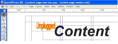
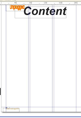
I used quark express in order to complete my product. I used this for the content page and the double page spread. I first entered my magazine name using the rectangle picture tool box this let me draw the shape i wanted and the size i wanted, i could then right click the box and import a photo. Secondly i used the text box tool to write "content", i used the arial font and size 85pt.
Next i used the text box tool to insert the web address and the page number, i made the web address at the bottom orange in order for it to continue with my colour scheme which was chosen in my audience reseach questionnaire. The size of the font for the web address is 12pt and for the page number it is 10pt.

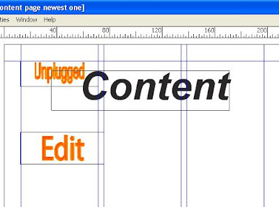
Next using photoshop i constructed the "edit" title, i used the same font as the unplugged and similar effects. Next i wrote the "editors letter" in mircosoft word, which i imported into quark express and made the background orange with white writing as this was a very typical of a music magazine which i researched.
The next thing i did was insert my front cover onto my content page as this also is popular in current music magazines on the market. 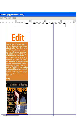

I then inserted the "headliners" title on my content page which will go with the main features. The i inserted a tool bar box and made the back ground black with the writing orange and white, this made up my feature articles. The first line was the bands name which was bold then the sub headings underneath where not bold.
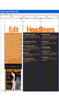
I then inserted the two pictires which make up the first page of my content page. Using the rectangle tool, and the importing the picture from which i can then scale the picture to the size of the box. I wrote the page number on or next to the picture ot anchor the image to the written content.
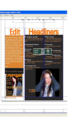

My second contents page is very similar to the first one because as you can see it`s the same design as the first page, it has the black background with 3 coloums which is very common in most music magazines i researched. i also have the page number in the left hand bottom corner and the website of the magazine. I have the title of the magazine and the word contents is the biggest word on the page which is a code and convention in all magazines.
I put 3 columns on my content pages also with the title repeasted on each page, i arranged the writing by page number then added text which was one to three words maximum long then sub text and finally i have the website address next to the page number.


No comments:
Post a Comment